Quick answer: To choose paint colors for your home, start with what will not change (flooring, countertops, large furniture), pick a whole-house palette of three to five related colors, and test large samples on several walls in morning, afternoon and evening light. Choose undertones that match your fixed finishes and use the 60-30-10 rule to balance wall, trim and accent colors.
Picking paint feels high stakes because the swatch never looks the same on your wall. A simple process takes the guesswork out, saves you from buying gallons you hate, and helps every room flow into the next.
Updated October 2026
Key takeaways
- Build your color choices around fixed elements like floors, tile, countertops and big furniture.
- Undertone matters more than the color name: warm, cool or neutral undertones decide whether a color clashes or blends.
- Always test large samples on at least two walls and check them at different times of day.
- A connected whole-house palette makes a home feel larger and more pulled together.
- Finish (sheen) changes how a color looks and how well it holds up to cleaning.
Where should you start when choosing paint colors?
Start with the things in the room you are not replacing. Your flooring, kitchen counters, bathroom tile, fireplace stone and sofa all have colors and undertones your paint has to work with.
Gather samples or photos of these fixed elements in one place. Many people pick a color they love from a photo, only to find it fights with their orange-toned oak floors or pink-beige tile. Starting with what stays prevents that.
Think about how you want each room to feel
Color affects mood. Soft blues and greens tend to feel calm and restful, which suits bedrooms and bathrooms. Warm whites and beiges feel welcoming in living areas. Deeper shades like navy, forest green or charcoal feel cozy and dramatic in dens, dining rooms or powder rooms.
How do you choose a whole-house color palette?
A whole-house palette is a short list of colors that work together, so you can move from room to room without jarring changes. It is especially useful in open floor plans where you can see several spaces at once.
- Pick your main neutral. This is the color for hallways, open areas and connecting spaces. Soft whites, warm greiges and light taupes are common choices.
- Choose two or three supporting colors. These go in bedrooms, offices or a dining room. They should share a similar undertone with your main neutral.
- Add one accent color. Use it for a front door, an accent wall, a powder room or built-ins.
- Pick one trim color. Using the same white for trim, doors and ceilings throughout ties the house together.
- Check them side by side. Lay all your chips together on a white sheet of paper. If one looks muddy or out of place, swap it.
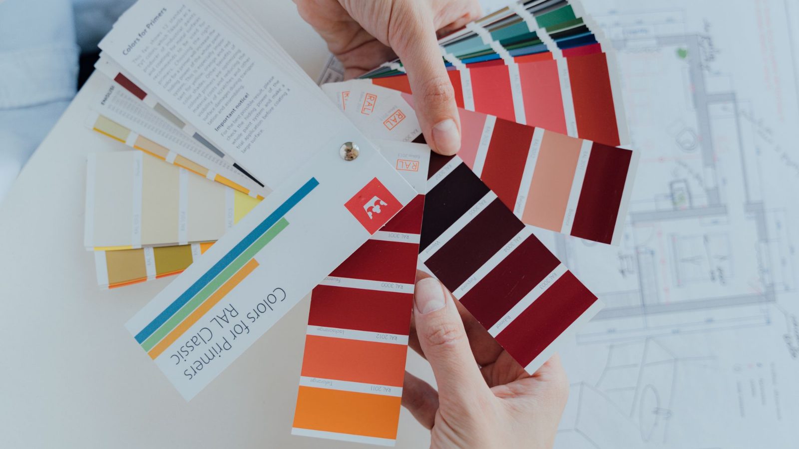
A shortcut many people use: choose colors from the same paint strip, using lighter versions for large rooms and darker versions for accents.
What are paint undertones and why do they matter?
Every color has an undertone, a subtle hint of another color underneath. A gray might lean blue, green or purple. A white might lean yellow, pink or blue. Undertones are why two “grays” can look completely different on the wall.
How to spot an undertone
- Hold the chip against a sheet of pure white printer paper. The undertone shows up more clearly by contrast.
- Compare several similar chips side by side. The differences between them reveal which way each one leans.
- Look at the darkest color on the paint strip. It usually shows the undertone most obviously.
Match undertones to your fixed finishes
Warm floors (oak, cherry, honey tones) usually pair best with warm or neutral paint. Cool finishes (gray tile, white marble, black metal) usually pair best with cool or neutral paint. When in doubt, a true neutral with minimal undertone is the safest choice.
Amelia’s tip: Skip the tiny chips and use large peel-and-stick samples or paint a sample onto a big piece of white poster board. Move it around the room for two or three days. A color you were sure about on day one often looks completely different by day three.
How does lighting change paint color?
Light is the reason paint looks different at the store, in daylight and at night. The direction your windows face makes a big difference.
| Room orientation | How the light looks | Colors that tend to work |
|---|---|---|
| North-facing | Cool, soft, bluish light all day | Warm whites, creamy neutrals, warm greiges; avoid very cool grays that can feel cold |
| South-facing | Bright, warm light most of the day | Most colors work; cool tones balance the warmth well |
| East-facing | Warm and bright in the morning, cooler in the afternoon | Warm neutrals and soft greens that look good in both lights |
| West-facing | Cooler in the morning, very warm and golden in the evening | Cooler neutrals or soft blues and greens to balance evening warmth |
Your light bulbs matter too. Warm white bulbs (around 2700K) make colors look warmer, while bright daylight bulbs (around 5000K) make them look cooler. Test samples under the bulbs you actually use at night.
How do you test paint colors before committing?
- Narrow your choices to two or three colors per room.
- Get large samples: peel-and-stick sheets or sample pots painted onto white poster board.
- Place samples on at least two walls, including one that gets direct light and one in shadow.
- Keep samples away from your current wall color edges so the old color does not distort them.
- Check each sample in the morning, midday, evening and under lamps at night.
- Look at the samples next to your floor, trim and furniture, not just at eye level.
- Live with them for at least two days before you decide.
Sample pots typically cost a few dollars each, which is a small price compared with repainting a room. Once you have chosen, our guide to how much it costs to paint a room will help you budget for paint, supplies and labor.
What is the 60-30-10 rule for paint colors?
The 60-30-10 rule is a simple way to balance color in a room. About 60 percent is your dominant color (usually the walls), 30 percent is a secondary color (furniture, curtains, a rug or cabinets), and 10 percent is an accent (pillows, art, accessories or a painted door).
It is a guideline, not a law, but it keeps a room from feeling flat or chaotic.
Which paint finish should you choose?
Sheen affects how color reads and how easy walls are to clean. Higher sheen looks slightly brighter and more reflective, and it shows wall imperfections more.
| Finish | Best for | Notes |
|---|---|---|
| Flat or matte | Ceilings, low traffic bedrooms, adult living rooms | Hides imperfections; harder to scrub |
| Eggshell | Living rooms, bedrooms, hallways | Soft glow; wipes clean reasonably well |
| Satin | Kitchens, bathrooms, kids’ rooms, high traffic areas | More durable and washable |
| Semi-gloss | Trim, doors, cabinets | Very durable; shows flaws |
Common paint color mistakes to avoid
- Choosing from a tiny chip. Colors almost always look stronger and darker on a full wall.
- Ignoring undertones. This is the most common reason a color “looks wrong.”
- Picking paint first. It is far easier to match paint to a sofa or rug than the other way around.
- Going too stark. Very bright, cool whites can feel cold, especially in north-facing rooms.
- Too many unrelated colors. Every room in a different bold color makes a home feel choppy.
Renting? Many landlords allow painting if you return walls to the original color, but always ask first. Our guide to updating a rental without losing your deposit covers safer alternatives. And if paint is part of a bigger refresh, see our list of budget home upgrades that add the most value.
Amelia’s picks for this project
- FrogTape Multi-Surface Painter’s TapeHelps you get crisp, clean paint lines without bleed.
- Bates 19 Piece Paint Roller KitRollers, brushes, tray and liners in one box for a DIY paint weekend.
- evelor A19 LED Light Bulbs (6 pack)Warm, efficient bulbs that cut lighting costs and flatter every room.
As an Amazon Associate, Amelia Jay earns from qualifying purchases. See all of Amelia’s picks
Frequently asked questions
What is the most popular paint color for a whole house?
Soft warm whites, light greiges and gentle taupes are among the most common whole-house choices because they work with many floors and furniture styles. They also make rooms feel bright and connected. The best choice for your home depends on your lighting and fixed finishes.
Should all rooms in a house be the same color?
They do not have to be, but using one main neutral for hallways and open areas helps a home feel cohesive. You can then use related colors in bedrooms and an accent in smaller spaces. Keeping trim the same color everywhere also ties rooms together.
Should paint be lighter or darker than the sample?
Paint usually looks darker and more saturated on a full wall than on a small chip. If you are unsure between two shades, many people choose the lighter one. Testing a large sample on your actual wall is the best way to know.
What color makes a small room look bigger?
Light, soft colors such as warm whites, pale grays and light blues or greens tend to make small rooms feel more open. Painting walls and trim in similar tones reduces visual breaks. A lighter ceiling color can also help the room feel taller.
How many paint colors should a house have?
Many homes look best with a palette of three to five main colors plus one trim color. This gives you variety from room to room while keeping the house feeling connected. Open floor plans usually benefit from fewer colors.
Choosing paint gets much easier once you work from your fixed finishes, respect undertones and test in real light. Take your time with samples, and you will love the result for years.